Flexbox 对齐项目基础教程文档
收录于 2023-04-20 00:10:05 · بالعربية · English · Español · हिंदीName · 日本語 · Русский язык · 中文繁體
align-items 属性与
justify content 相同。但在这里,项目在交叉访问中(垂直)对齐。
用法-
align-items: flex-start | flex-end | center | baseline | stretch;
flex-start
将此值传递给属性 align-items 后,弹性项目在容器顶部垂直对齐。
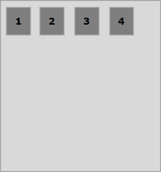
以下示例演示了将值
flex-start 传递给
align-items 属性的结果。
<!doctype html>
<html lang = "en">
   <style>
      .box1{background:green;}
      .box2{background:blue;}
      .box3{background:red;}
      .box4{background:magenta;}
      .box5{background:yellow;}
      .box6{background:pink;}

      .box{
         font-size:35px;
         padding:15px;
      }
      .container{
         display:flex;
         height:100vh;
         align-items:flex-start;
      }
   </style>

   <body>
      <div class = "container">
         <div class = "box box1">One</div>
         <div class = "box box2">two</div>
         <div class = "box box3">three</div>
         <div class = "box box4">four</div>
         <div class = "box box5">five</div>
         <div class = "box box6">six</div>
      </div>
   </body>
</html>
flex-end
将此值传递给属性
align-items 后,弹性项目在容器底部垂直对齐。
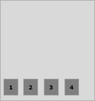
以下示例演示了将值
flex-end 传递给
align-items 属性的结果。
<!doctype html>
<html lang = "en">
   <style>
      .box1{background:green;}
      .box2{background:blue;}
      .box3{background:red;}
      .box4{background:magenta;}
      .box5{background:yellow;}
      .box6{background:pink;}

      .box{
         font-size:35px;
         padding:15px;
      }
      .container{
         display:flex;
         height:100vh;
         align-items:flex-end;
      }
   </style>

   <body>
      <div class = "container">
         <div class = "box box1">One</div>
         <div class = "box box2">two</div>
         <div class = "box box3">three</div>
         <div class = "box box4">four</div>
         <div class = "box box5">five</div>
         <div class = "box box6">six</div>
      </div>
   </body>
</html>
中心
将此值传递给属性
align-items 后,弹性项目会在容器的中心垂直对齐。
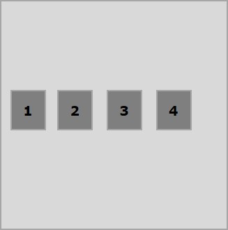
以下示例演示了将值
flex-center 传递给
align-items 属性的结果。
<!doctype html>
<html lang = "en">
   <style>
      .box1{background:green;}
      .box2{background:blue;}
      .box3{background:red;}
      .box4{background:magenta;}
      .box5{background:yellow;}
      .box6{background:pink;}

      .box{
         font-size:35px;
         padding:15px;
      }
      .container{
         display:flex;
         height:100vh;
         align-items:center;
      }
   </style>

   <body>
      <div class = "container">
         <div class = "box box1">One</div>
         <div class = "box box2">two</div>
         <div class = "box box3">three</div>
         <div class = "box box4">four</div>
         <div class = "box box5">five</div>
         <div class = "box box6">six</div>
      </div>
   </body>
</html>
拉伸
将此值传递给属性
align-items 后,弹性项目将垂直对齐,从而填满容器的整个垂直空间。
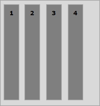
以下示例演示了将值
stretch 传递给
align-items 属性的结果。
<!doctype html>
<html lang = "en">
   <style>
      .box1{background:green;}
      .box2{background:blue;}
      .box3{background:red;}
      .box4{background:magenta;}
      .box5{background:yellow;}
      .box6{background:pink;}

      .box{
         font-size:35px;
         padding:15px;
      }
      .container{
         display:flex;
         height:100vh;
         align-items:stretch;
      }
   </style>

   <body>
      <div class = "container">
         <div class = "box box1">One</div>
         <div class = "box box2">two</div>
         <div class = "box box3">three</div>
         <div class = "box box4">four</div>
         <div class = "box box5">five</div>
         <div class = "box box6">six</div>
      </div>
   </body>
</html>
基线
将此值传递给属性
align-items 后,弹性项目将对齐,使其文本的基线沿水平线对齐。
以下示例演示了将值
baseline 传递给
align-items 属性的结果。
<!doctype html>
<html lang = "en">
   <style>
      .box1{background:green;}
      .box2{background:blue;}
      .box3{background:red;}
      .box4{background:magenta;}
      .box5{background:yellow;}
      .box6{background:pink;}

      .box{
         font-size:35px;
         padding:15px;
      }
      .container{
         display:flex;
         height:100vh;
         align-items:baseline;
      }
   </style>

   <body>
      <div class = "container">
      <div class = "box box1">One</div>
      <div class = "box box2">two</div>
      <div class = "box box3">three</div>
      <div class = "box box4">four</div>
      <div class = "box box5">five</div>
      <div class = "box box6">six</div>
      </div>
   </body>
</html>